00 —Jawalat El Horouf
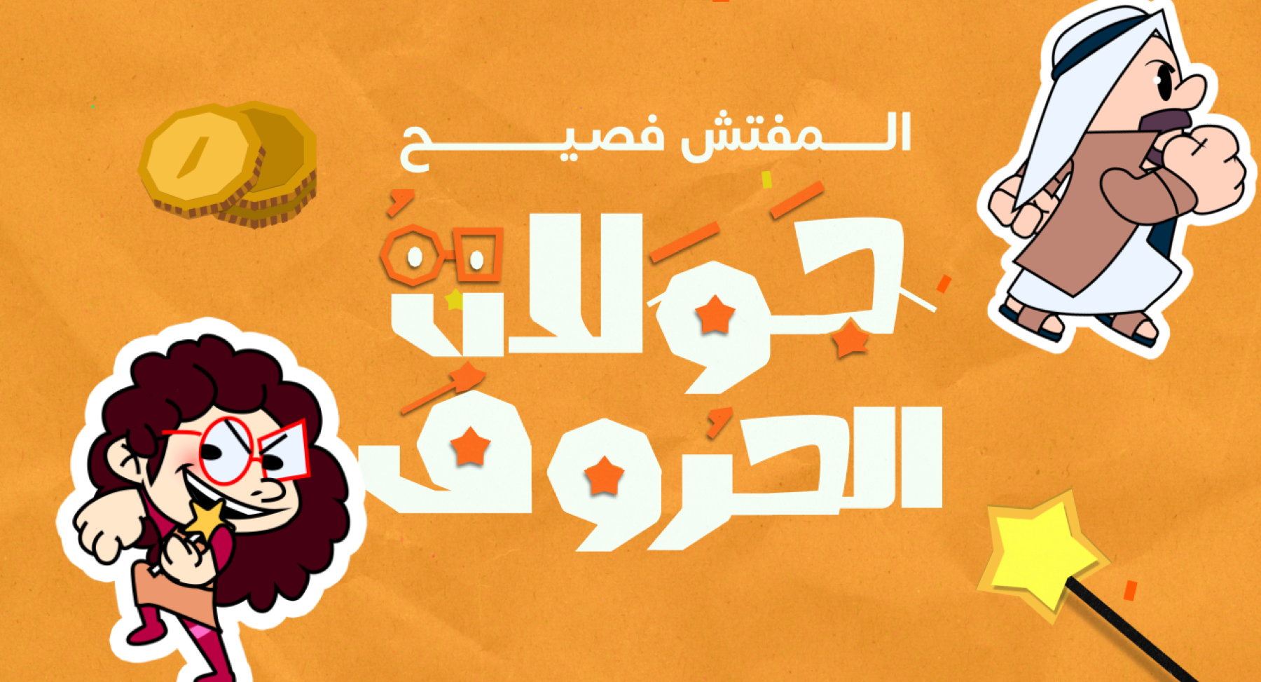
During my work on Jawalat El Horouf, I contributed to the UI/UX design of a licensed Arabic party game inspired by board-game and mini-game experiences such as Mario Party, Pummel Party, and Crash Bash.
01 — Faseeh TV Show
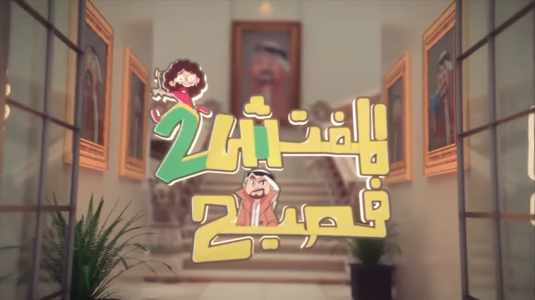
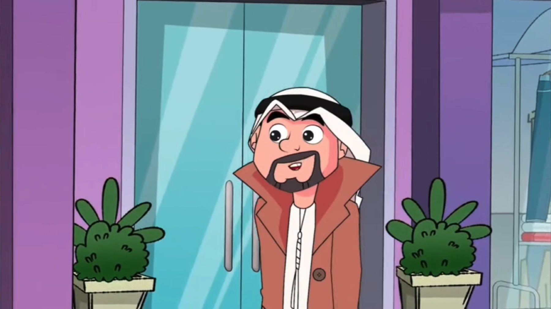
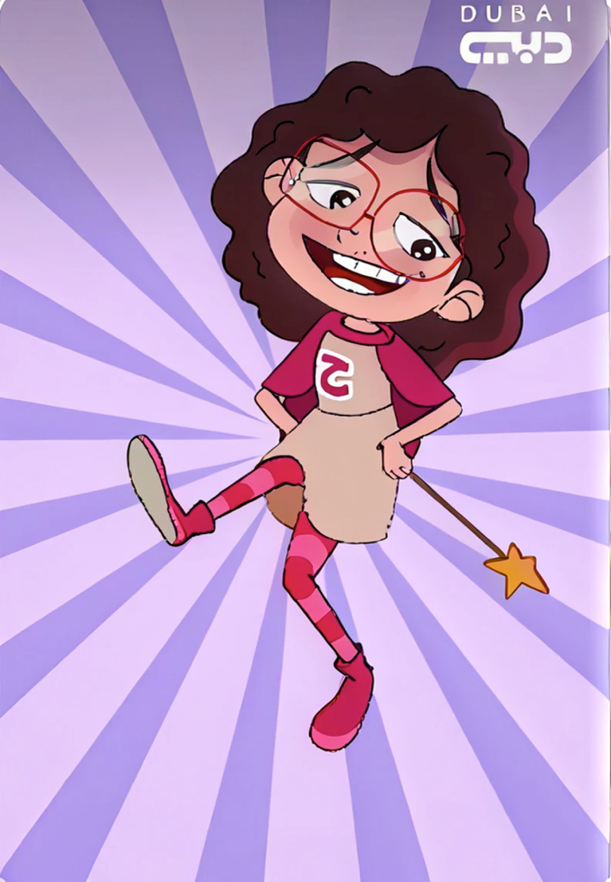
The game draws inspiration from the Arabic show Elmofatesh Faseeh, a well-known production by Dubai Media. It showcases a rivalry between Faseeh, the Arabic teacher, and his adversary Haysoofa, the eccentric witch with a disdain for language. In the game, these two characters take center stage alongside other figures, including a police officer and a quirky fish mascot.
01 — Design concept
Building a board game structure into a digital multiplayer experience
Jawalat El Horouf combines several layers of play. Players move around a shared board, roll dice, make directional choices, encounter traps and shops, earn coins, and periodically enter competitive mini-games.
Building a world from paper, books, and missing pages
The story begins inside a library.
Something happens to a book, its pages are scattered, and players spend the game travelling through different environments while trying to recover what was lost.
03 — References & Mood
That narrative gave us the foundation for the visual direction.
During the first design phase,
I collected references from games such as Paper Mario and Yoshi’s Crafted World to understand how crafted materials could become part of the interface without making the experience feel overly childish or literal.
I was involved in to:
- the concept designing and building a backstory for the game-board
- testing other references to find the benchmarks pain points in a the game genre.
- Building a reference UI library for the art team to have a cohesive design experience.
03 — Show analysis
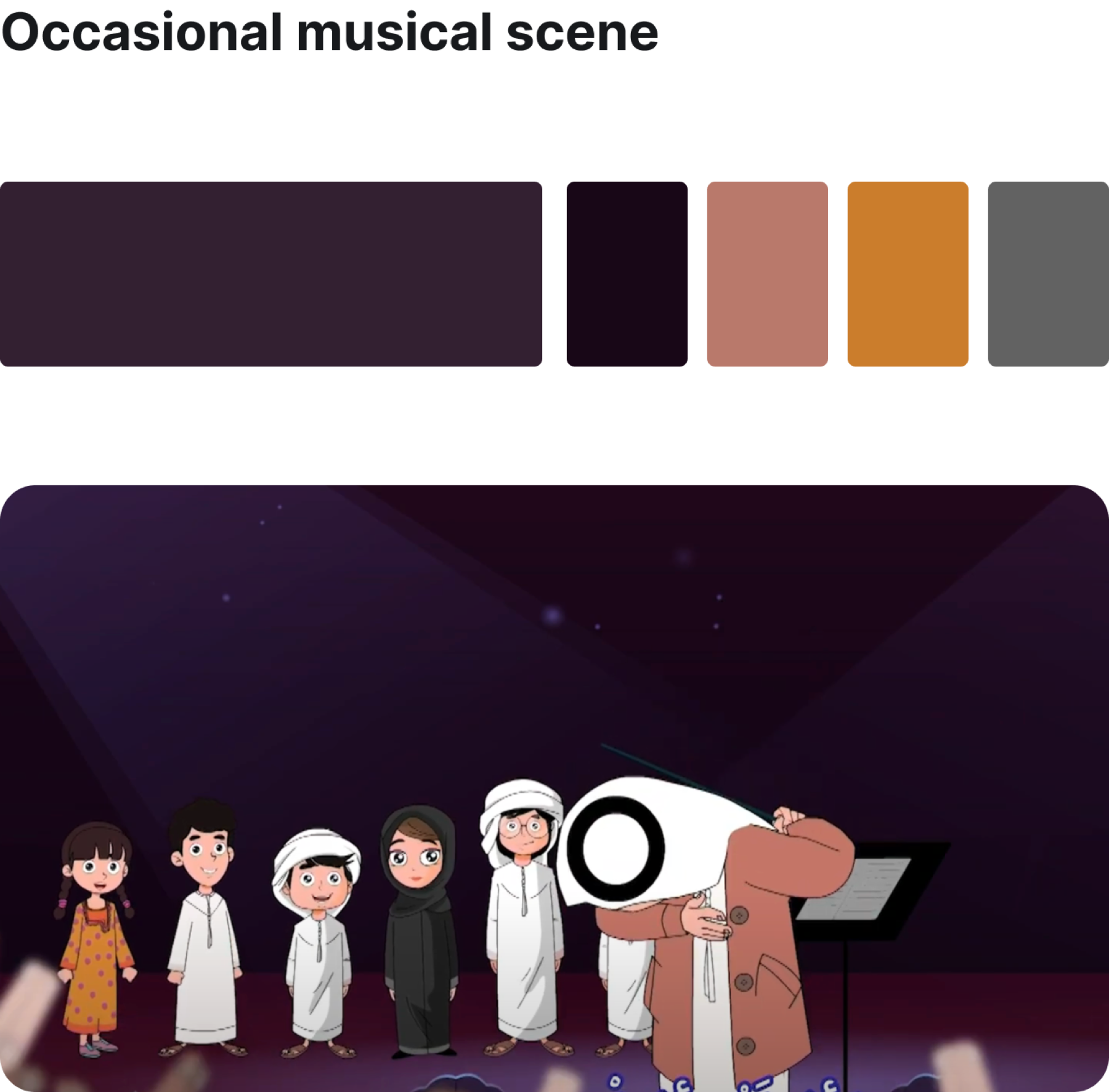
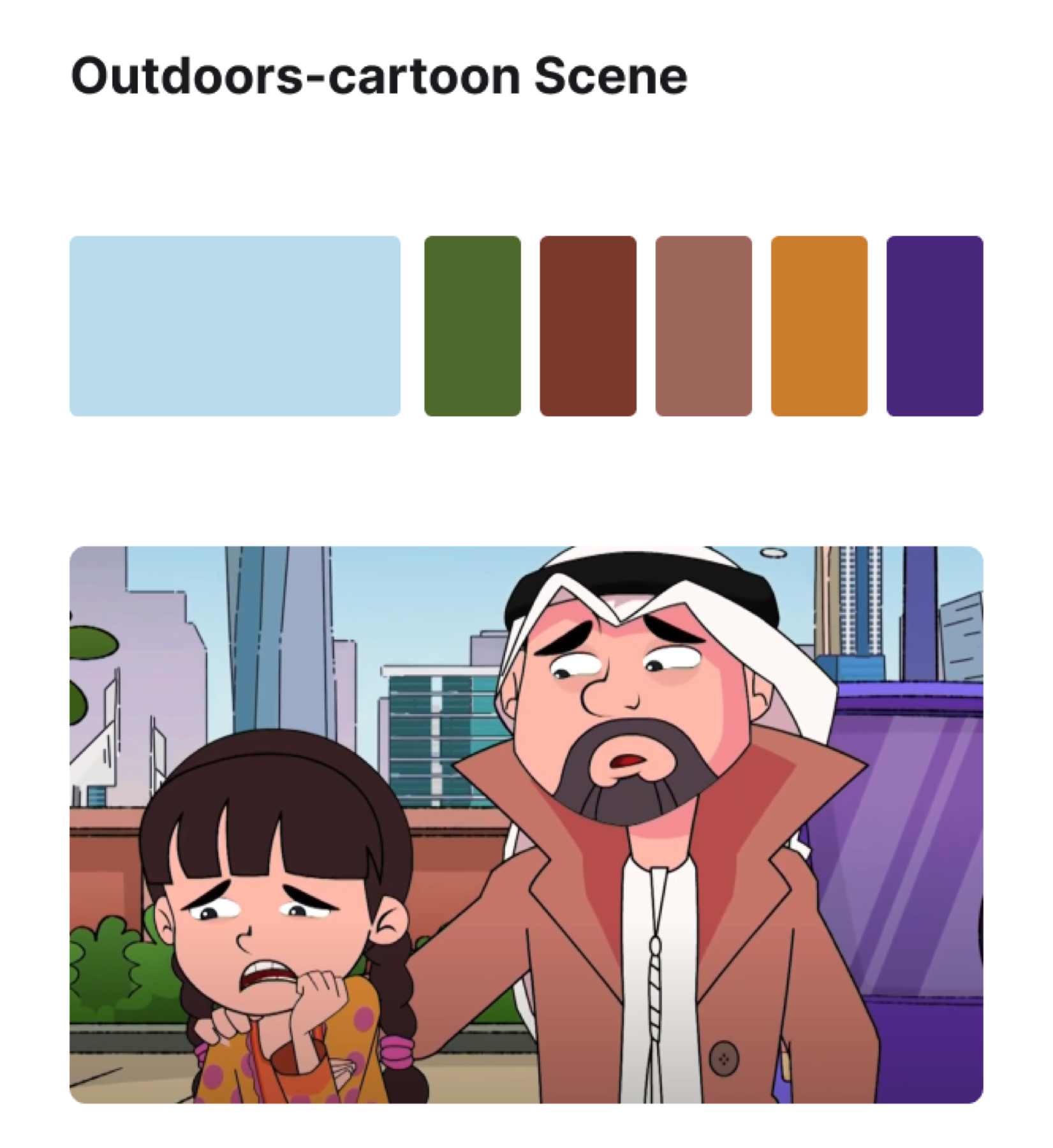
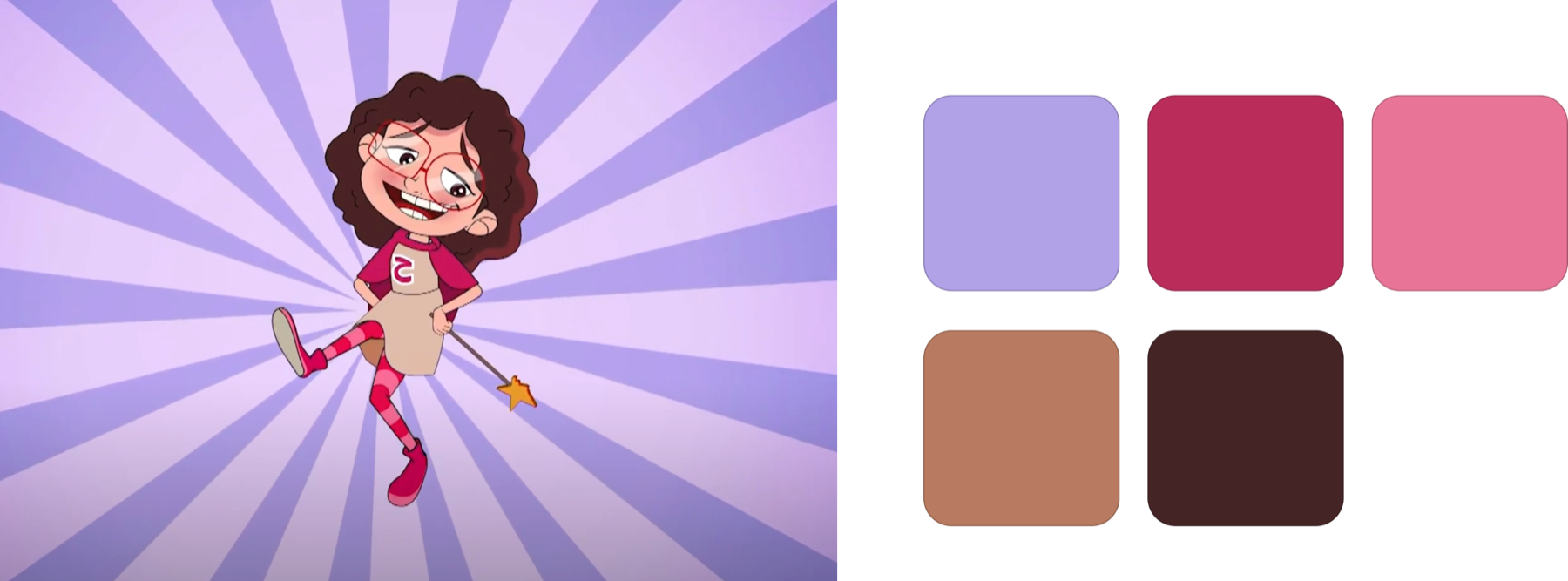
Striking the perfect balance between handcrafted and digital elements is key. I began by analyzing the show's color palette, choosing both occasional and frequently occurring frames to showcase the variety of colors commonly featured in the show.
03 — Wire framing
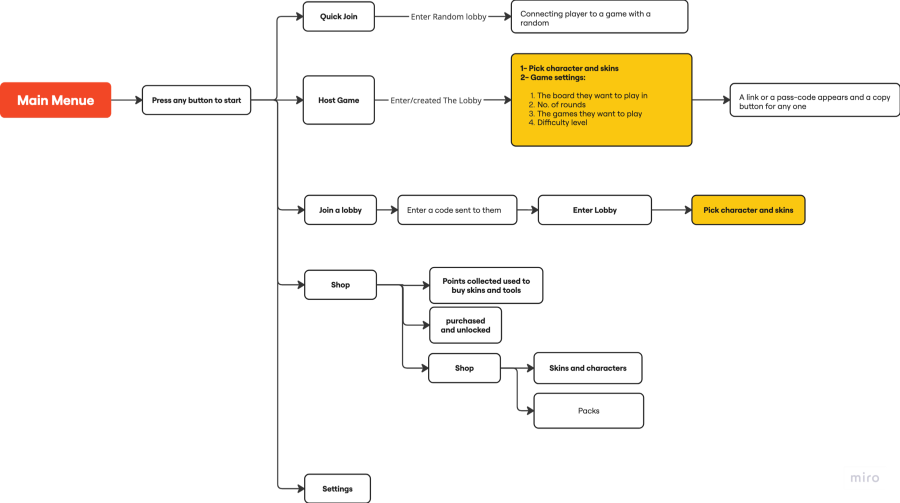
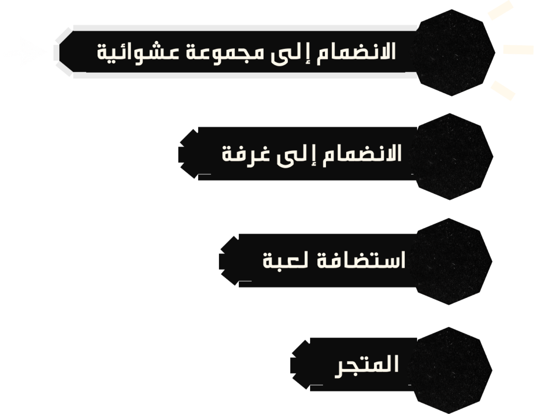
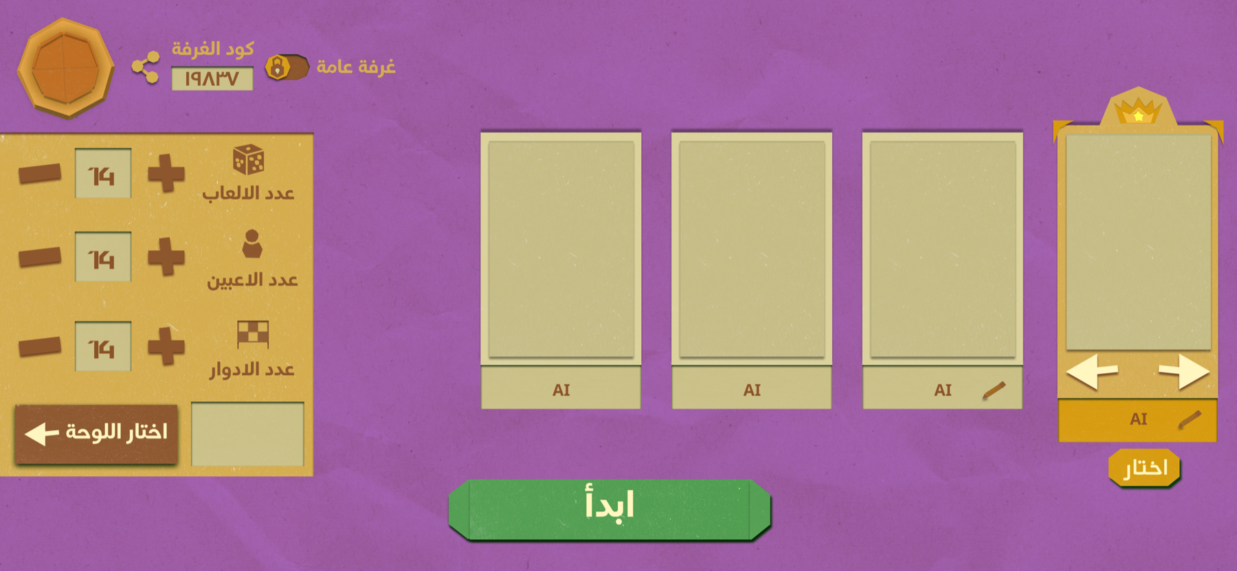
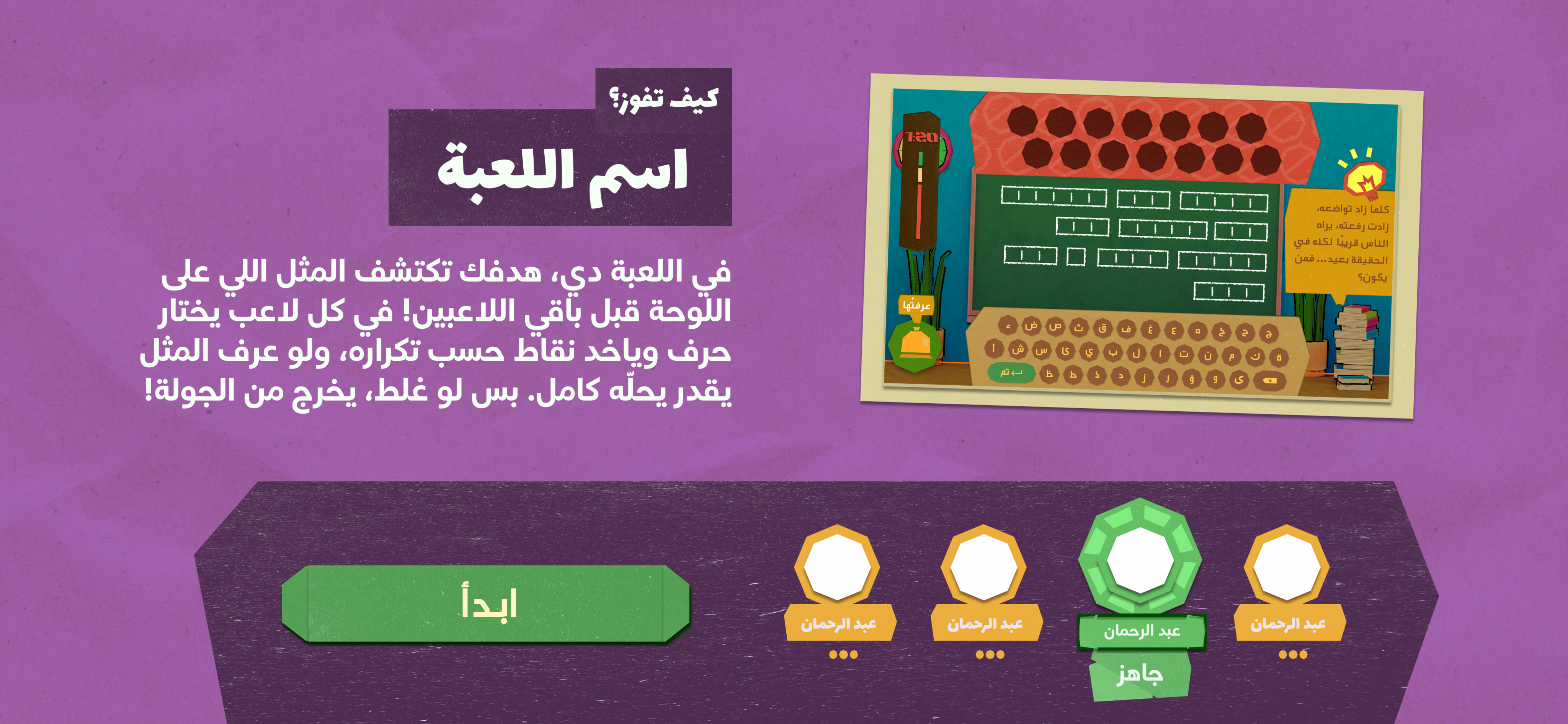
The strategy involved merging insights from current games and benchmarks with our distinctive features to develop a semi-educational experience which was highlighted in the mini-games UX. This outlined the typical flow for navigating the pre-game experience, including lobby selection, network settings, and a shop for avatars and customizations (note that the shop was not part of the MVP).
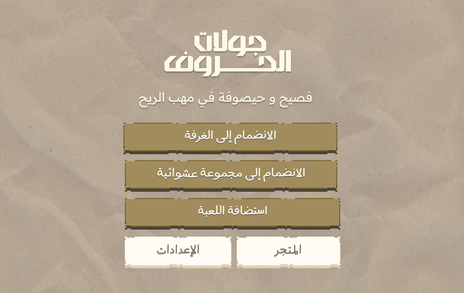
Home page (picking the type of lobby)
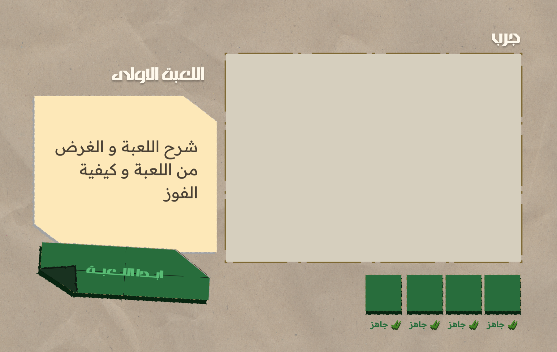
Tutorial screens
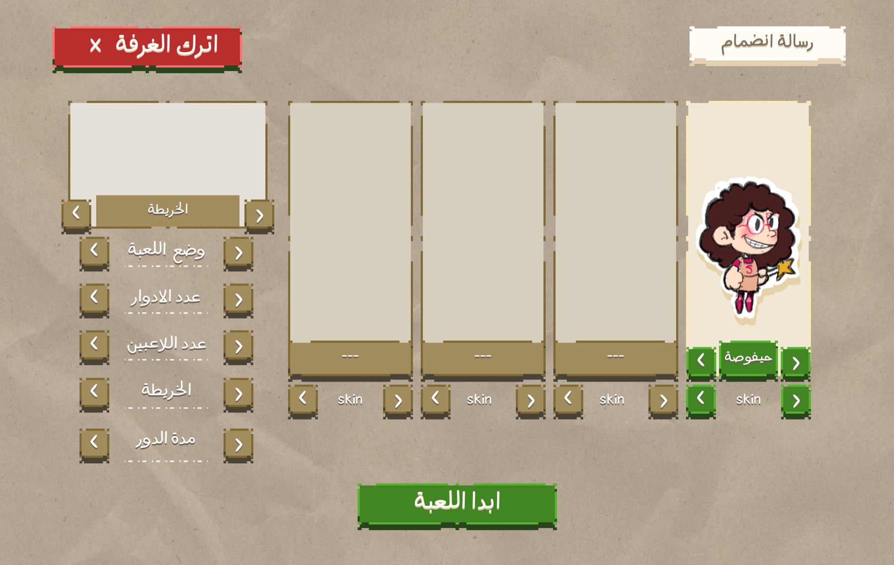
Lobby character picking
03 — Sketches and experimentations
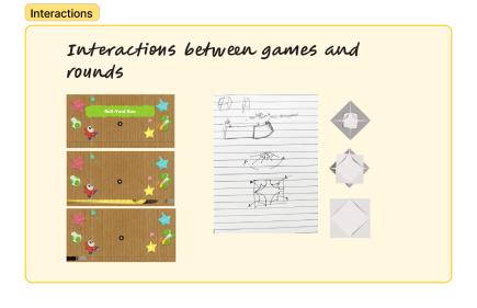
Since the game world was designed to reflect the show, I focused on selecting the perfect colors palette and crafting scenes that felt authentic.
Eventually, I started to experiment with books and paper aesthetic, ensuring the UI felt tactile while still functioning like a contemporary game interface.
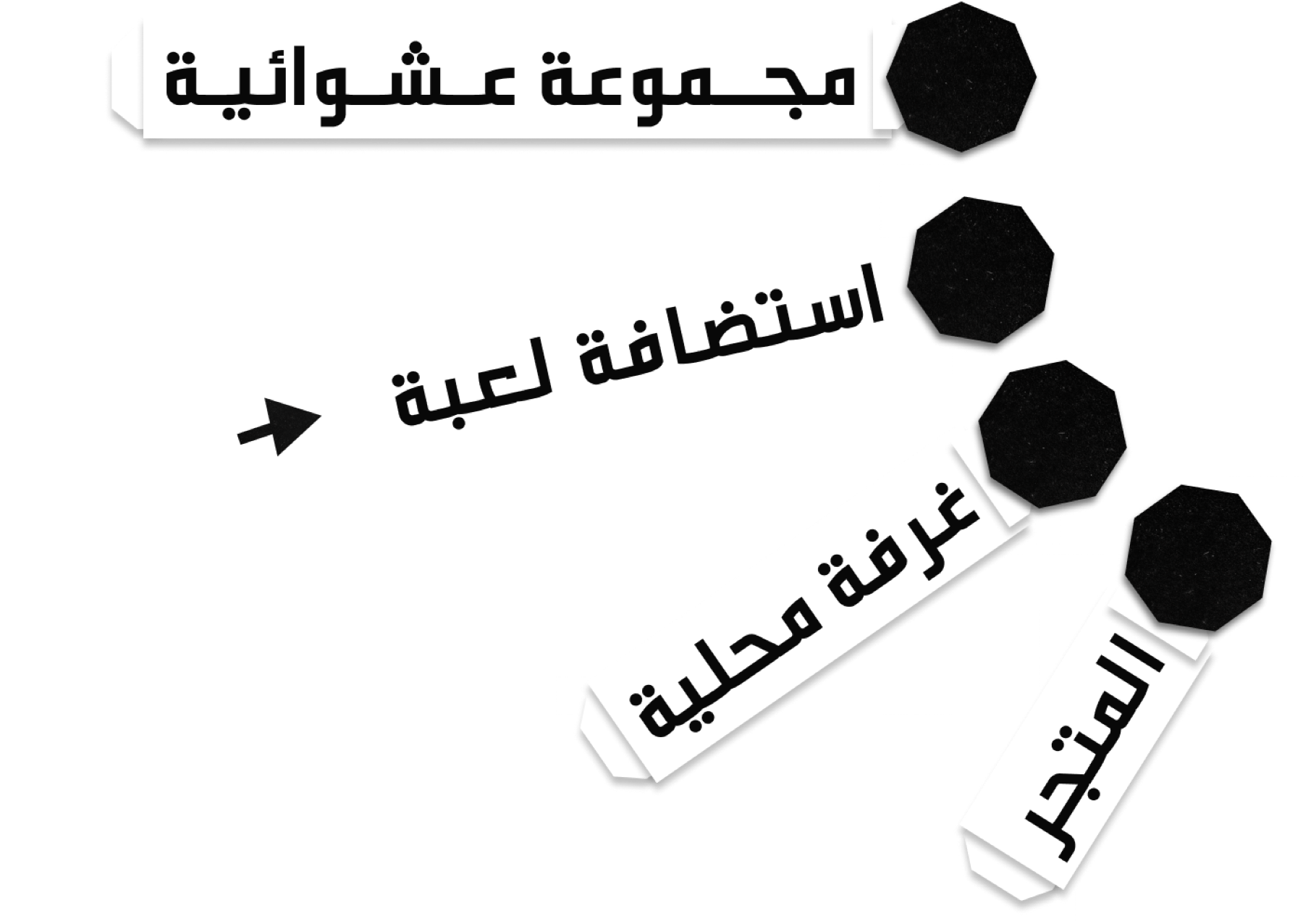
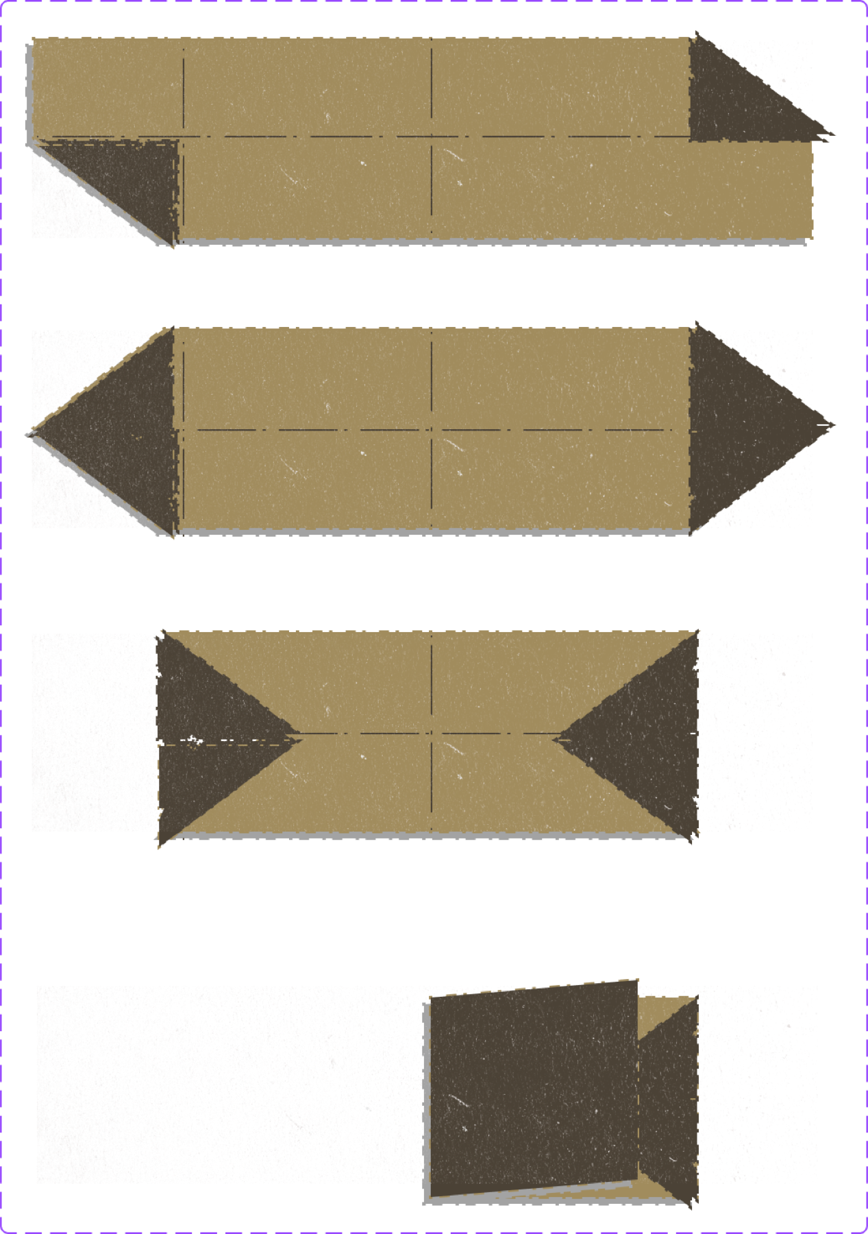
I experimented with layered paper cards, origami-inspired shapes, sticker-like UI elements, bold typography, playful transitions, vibrant and legible player colors, and enhanced feedback for interaction states.

The design Outcome
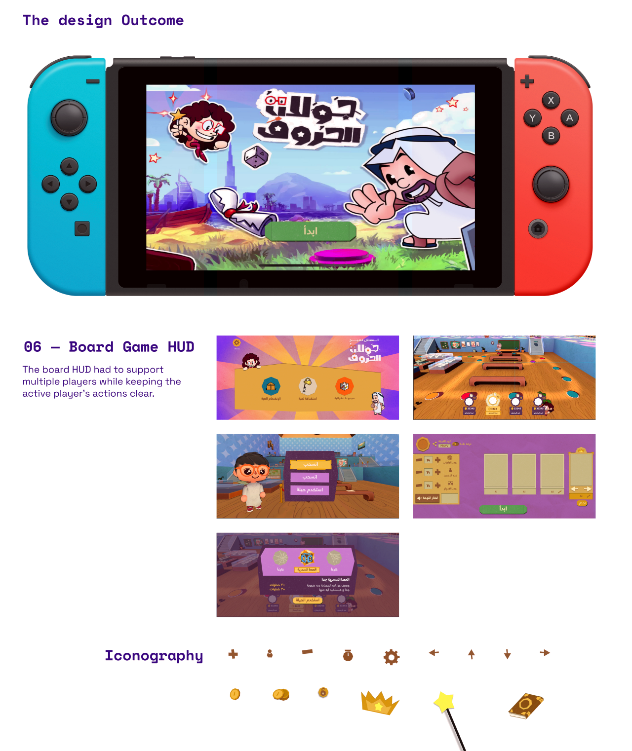
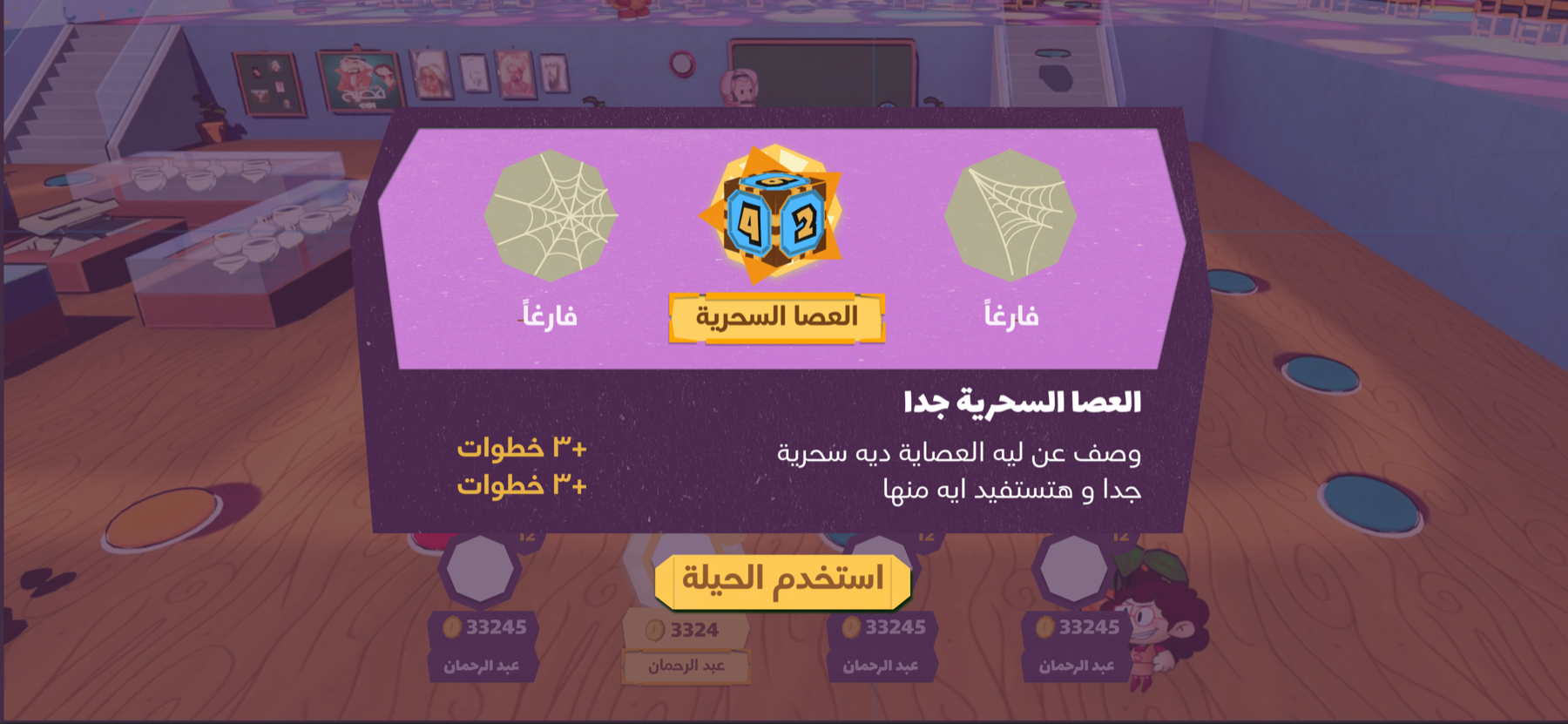
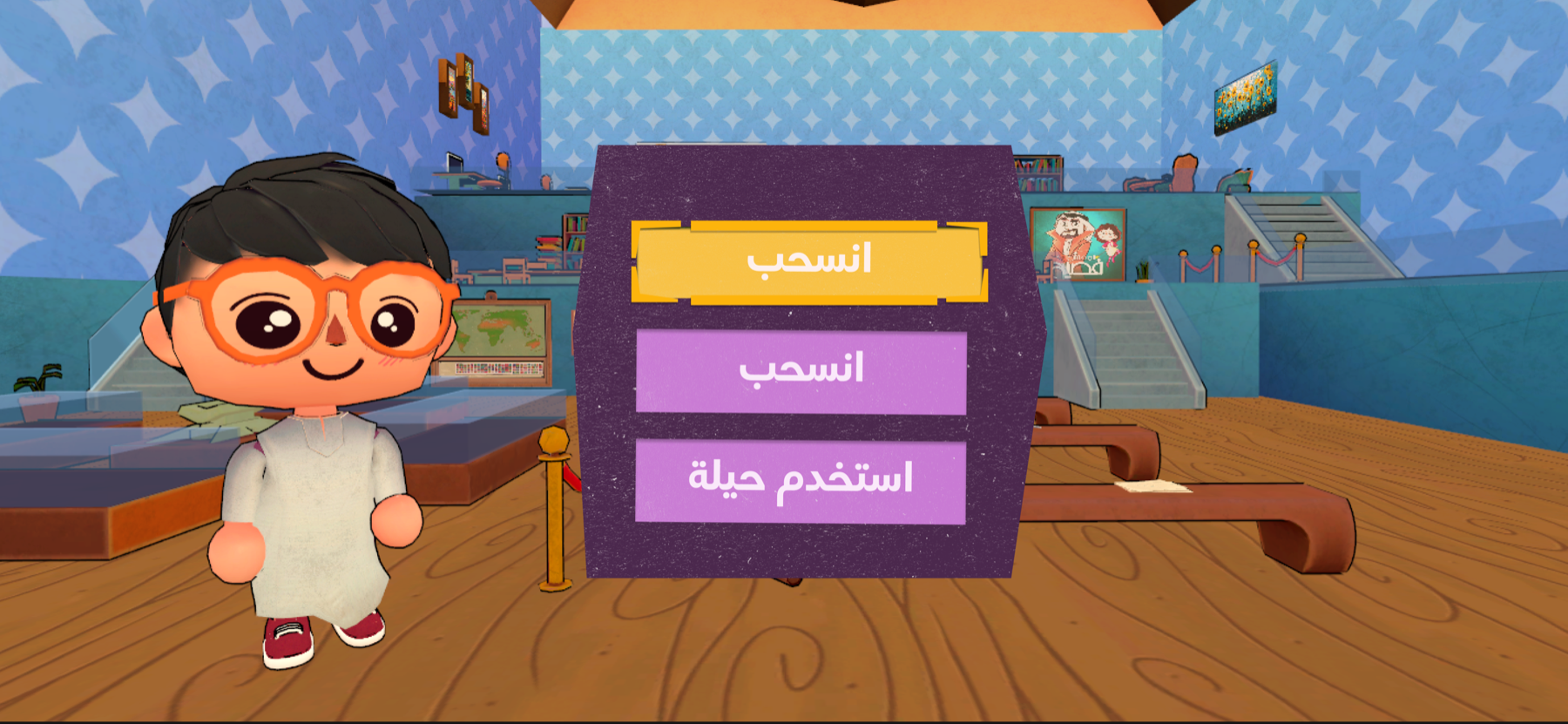
06 — Board Game HUD
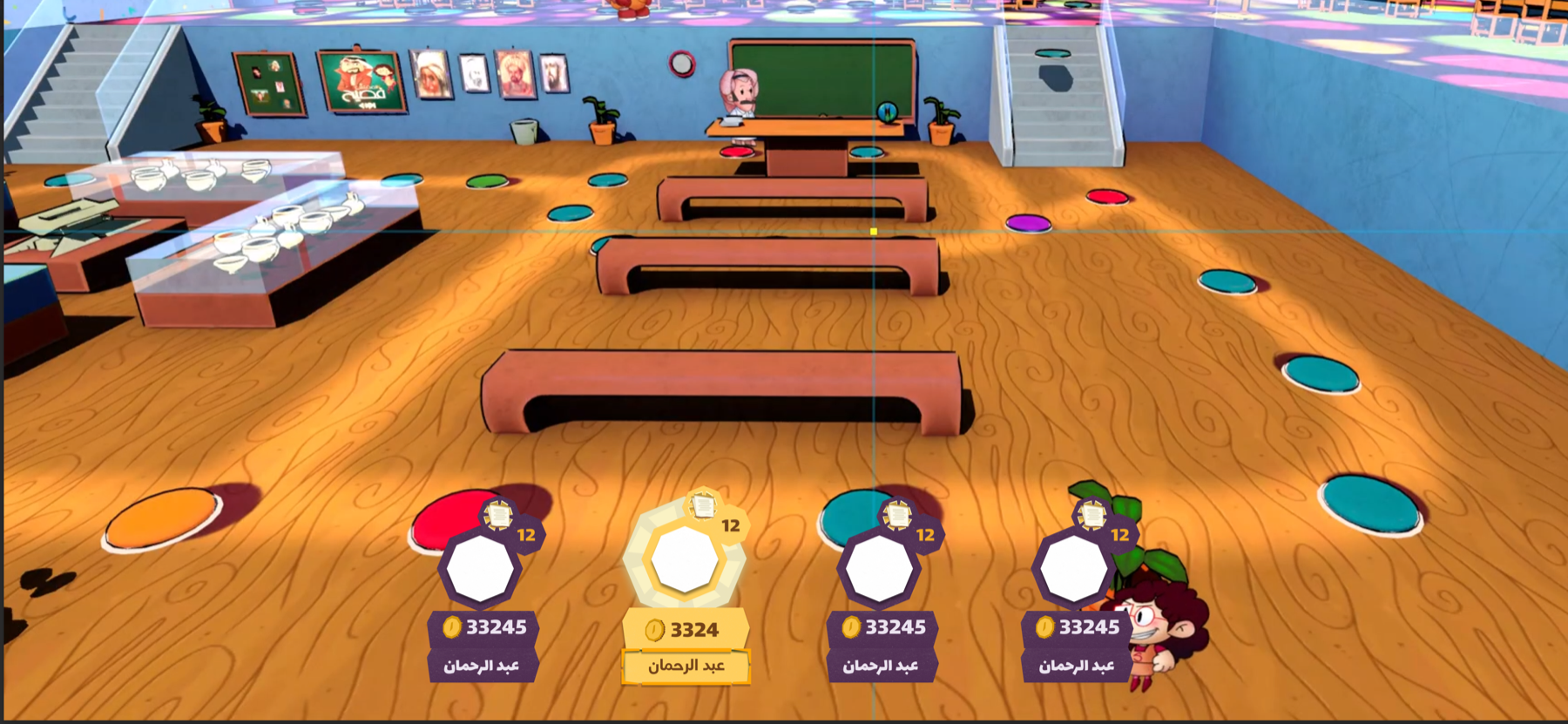
The board HUD had to support multiple players while keeping the active player's actions clear.
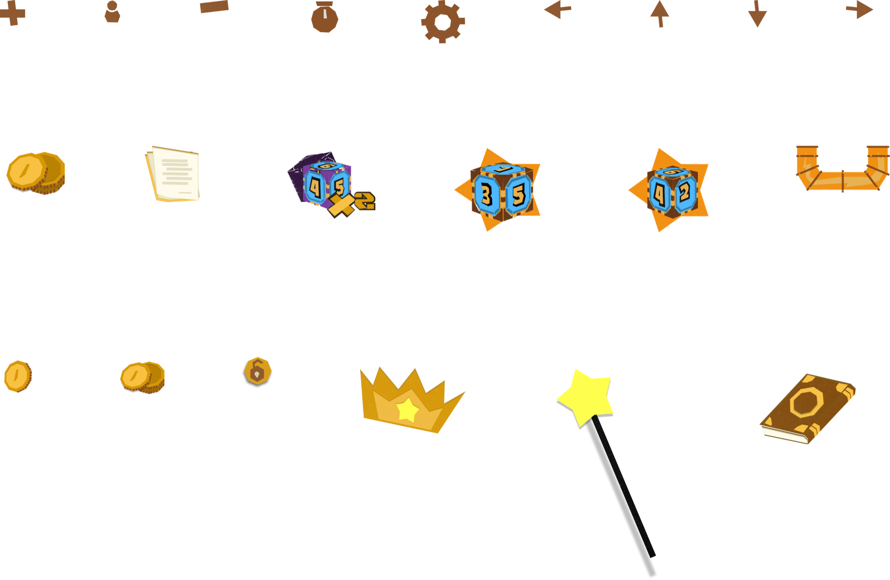
Iconography
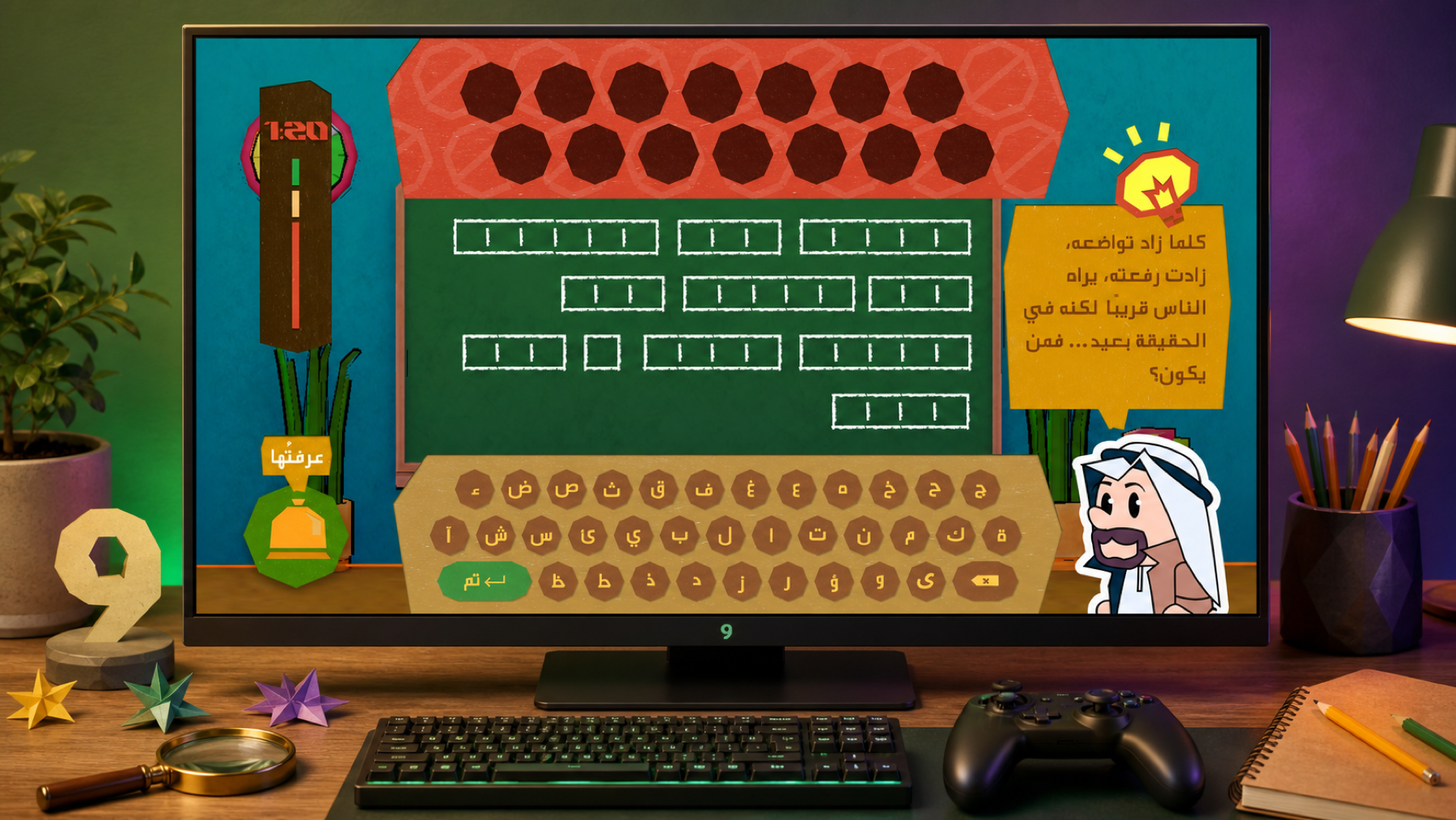
06 — Sneak peeks on minigame
The board HUD had to support multiple players while keeping the active player's actions clear.
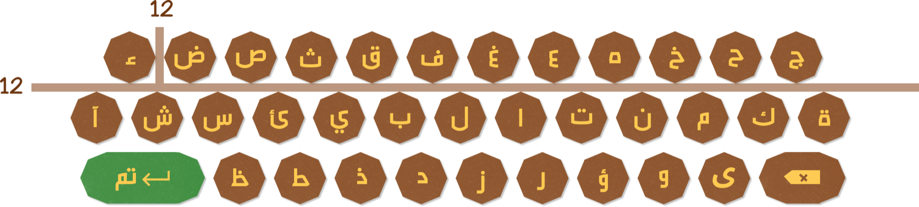
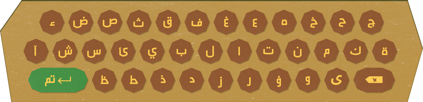
Some of the assets

06 — Minigame 2
Minigame 3
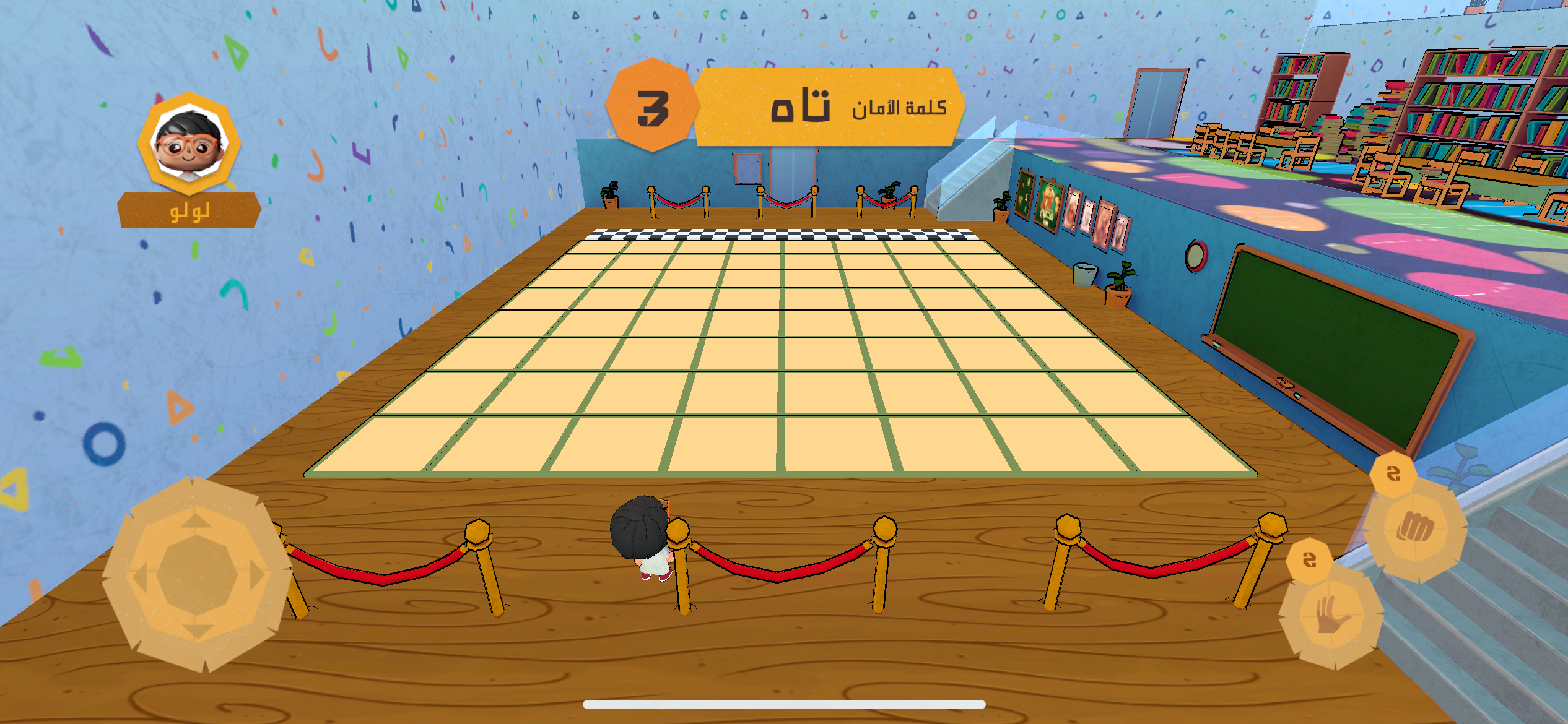
Minigame 4
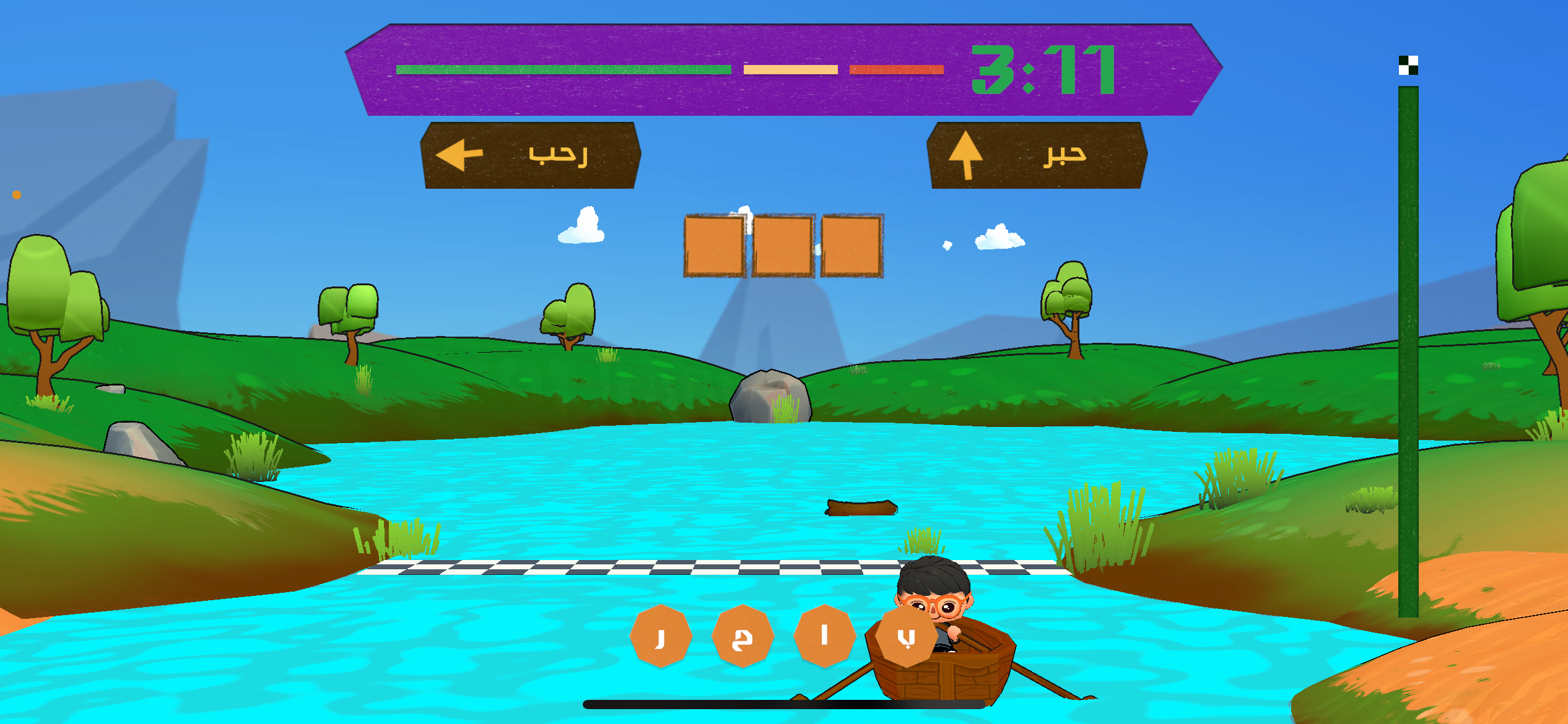
Buffer screens
00 — Social Media
The project scope needed me to design the whole game identity, for both the UI/UX and branding guide (how to use it including in social media campaigns)